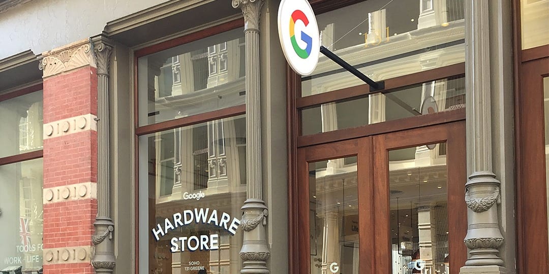
A welcome addition to THX, Theory House’s retail experience event, came with Google’s announcement of a new pop-up shop experience in SoHo. Opening day happened to coincide with the day of our tours. We were excited to visit for this and several other reasons, including our relationship with Google as one of their retail marketing partners – some of our Google clients were even there with us.
As a leading platforms and ecosystems provider, often working with other leading manufacturers to bring shared products to market, Google is challenged with creating and delivering uniquely Google experiences at retail. However, its expanding portfolio of first party products has increased demand for Google-owned retail environments, helping to bolster the brand’s retail presence and stature across the board.
Let’s check out the store:
Merchandising
This store is one of few opportunities Google has to tell a complete Google product story. Now with a full portfolio of devices across computers, tablets, phones and smart speakers; a growing sub-brand in Pixel; and strength in smart home tech with Nest; the Google Hardware story is the mobilization of all these efforts.
To be expected – partly driven by the focused assortment – the store leveraged the center of the store to tell clean and simple product stories, merchandised by different customer use cases. Familiar consumer electronics practices were leveraged to display and educate customers on devices. The surrounding walls were merchandised to be shop-able for more grab-and-go products, while other areas were used to curate specific brand and product stories, like Pixel and smart home.

Experience
Because we were visiting on grand opening day, the store was likely busier and more staffed than it would normally be. This created a level of energy throughout the store that wouldn’t be expected at all times. Still, the store was airy and open with the environmental design and messaging meant to evoke feelings of a traditional hardware store throughout. This created a sense of uniqueness and a curiosity while shopping, as it was different from how you would typically experience a technology brand or consumer electronics store. Product was tightly curated in the front half of the footprint, which supported easy navigation and promoted more frequent product interaction.
The other half of the store was an entirely different set of experiences which we’ll examine in a moment.
Brand Story
Again, and as seen in the accompanying photos, the hardware store theme was applied throughout the store. The smallest of details were considered. The storefront masterfully replicated that of an old neighborhood shop, with a Google bike out front for a bit of character and unique branding. Details across fixtures, signage and merchandising aided in conveying the hardware story at every customer touch point. Familiar hardware items and materials like paint cans and peg board were leveraged to create a clever visual dichotomy between the traditional and modern technological definitions of “hardware”.

X-Factor
Finally, as mentioned, the other side to this store was dedicated to creating individualized brand moments that facilitated more spontaneous interaction and engagement. These moments allowed Google to step away from the hardware product story and bring a few of its lead consumer products to life. Leveraging artfully designed home scenes and product demonstrations, the Google Photos, Assistant and Play stories reflected the seamless interaction we can have with them throughout our daily lives. Clever uses of technology also promoted unique interaction in each vignette, such as playful areas like the Pixel Photo Op and Personalization Station which facilitated immersive, sharable moments with the brand.
Overall, the store itself was a combination of everything Google is and clearly aspires to be – your complete toolkit for living, working and exploring in a technology-enabled world.


